TT
Tile Tools
Tile & masonry tools (Shopify)
Revenue doubled year-over-year at roughly 5× ROAS
Conversion rate optimization is how you get more customers from the visitors you already have, wherever they come from. No more traffic required. No rebuild. We find where your funnel leaks, then test our way to fixing it.
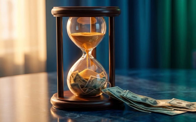
Every visitor who leaves without converting is money you already spent, wasted. CRO is the highest-leverage marketing you can do, because you're not buying more attention, you're keeping more of what you've got.
You can have perfect targeting and still lose the sale on a slow page, a confusing form, or a checkout nobody trusts. CRO fixes the part of the journey your ad budget can't touch.
Doubling your conversion rate has the same effect as doubling your ad spend, except it costs a fraction and compounds on every visitor from here on out.
We don't redesign on a hunch and hope. We form a hypothesis, run a controlled test, and let your real visitors settle the argument. You keep what wins.
They sound similar. They're not. Here's the honest difference so you don't pay for the wrong one.
Need the page built first? That's our Landing Page Development service. CRO is for making the funnel you already have convert better.
No teardown required. We work with your existing site, stack, and traffic, and make the pieces that are already there convert more of the people already showing up.
The pages that carry the most traffic and the most doubt. We clarify the message, sharpen the offer, and cut the friction.
Where browsers decide to buy or bounce. Better layout, trust signals, and offers that move product, not just impress.
The most expensive place to lose someone. We shorten forms, kill dead ends, and rescue carts that were one field away from converting.
Most of your traffic is on a phone. We optimize for thumbs, small screens, and short patience, where most funnels quietly fall apart.
Timed right, they convert. Timed wrong, they annoy. We test the offer, timing, and trigger so capture helps instead of hurts.
Every second of load time costs conversions. We find the drag, the dead clicks, and the confusion that make people give up.
A repeatable program, not a one-off redesign. Diagnose, prioritize, test, repeat, so the gains keep compounding instead of stopping at launch.
We dig into your analytics, heatmaps, session recordings, and funnel data to find exactly where people drop, and why. No guessing, no generic "best practices."
Not every fix is worth testing. We rank opportunities by impact, confidence, and effort (the ICE framework), so we start where the money is.
We run controlled A/B and multivariate tests on your real traffic, keep the winners, and roll straight into the next test. Your conversion rate climbs month over month.
The Conversion Framework
 01
01Pre-header Strip
The thin strip above your hero is the most-seen line on the page. It rides above the fold and follows the scroll, so give it exactly one high-value message, a real offer or a free-shipping threshold, or leave it off. The one mistake that wastes it: cramming five rotating messages nobody reads.
 02
02Hero
Most landing page heroes fail the same five-second test. Here's how to build one that answers the three questions every visitor is silently asking - before they bounce.
 03
03Trust Strip
The row of logos and badges under your hero is the most-seen, least-thought-about band on the page. In the half-second after your headline, a visitor decides whether you are legit, and the trust strip either passes that gut check or fails it before a word gets read.
 04
04Problem / Pain
The highest-converting landing pages spend a whole section describing the visitor's problem back to them before pitching anything. Here's why it works, and how to write it.
 05
05Solution
The heart of your page is the moment you say what you do - and most businesses describe a product when they should be promising an outcome. Here's how to write the value proposition that actually moves people.
 06
06Benefits
Most landing pages list what the product is, feature by feature - and every bullet gets the same silent reply: so what? The Benefits section is where you translate features into the outcomes people actually buy. Here is how.
 07
07How It Works
A visitor can want the outcome and still not convert, because they can't picture what happens after they click. Here's the 'how it works' section that removes that fear - and most pages skip it.
 08
08Offer
Most landing pages just describe what you sell. The ones that convert make an actual offer - a clear, valuable reason to act now. Here's the difference, and how to build one.
 9-10
9-10Social Proof & Deep Proof
Every landing page has a few five-star quotes nobody reads. Real social proof isn't a checkbox - it's a ladder, and most businesses are standing on the bottom rung. Here's how to climb it.
 11
11Service Detail
'Sell benefits, not features' got taken too far, and a lot of pages stripped the specs out entirely. But the buyer who already wants it has one last question before they buy: will this actually fit my situation? The detail section is where you answer it, on the page, before they leave to find out.
 12
12Objection Handling
The doubts that stop a sale rarely land in your inbox - the visitor just leaves with them. Here are the four objections every buyer brings, and how to answer them on the page.
 13
13Comparison
Most businesses cut the comparison section out of their landing page out of fear. But your buyer is already weighing you against the alternative. The only question is whether it happens on your page, where you set the criteria, or somewhere you'll never see.
 14
14Risk Reversal
Right before someone buys, one fear spikes: what if I'm wrong? Risk reversal takes that fear off their shoulders and puts it on yours - and bolder guarantees convert more and get abused less. Here's how to build one.
 15
15Urgency
Real urgency is one of the most powerful closers on a landing page. Fake urgency - the resetting timer, the 'only 3 left' that's always 3 - is one of the fastest ways to look cheap and lose the buyers you most want. Here's the line between them.
 16
16Form / Checkout
You paid to get someone to your form, then handed them a wall of fields - and a lot of them leave. The form is the cash register, not paperwork. Here's how to design one that converts: field discipline, form length as a strategic lever, and the reassurance line most businesses skip.
 17
17CTA Close
The visitor who reads your whole landing page is your warmest lead - and most pages reward them with a footer. The closing section is a full re-pitch for the person most ready to say yes. Here's how to build it.
 18
18Trust Footer
Most footers are a legal-and-navigation graveyard. But a buyer about to commit scrolls to the very bottom for one last gut check: are these real, reachable people who will still be here after the sale? Answer it, and the quietest section on the page closes the deal.
We're tool-agnostic. We run a best-in-class CRO stack on top of whatever you already use, no rip-and-replace, and it works the same for any client, in any industry.







Already using something else? Great. We'll work with your stack instead of forcing a switch.
Same traffic. A better conversion rate. Drag the sliders to see what optimizing your funnel is actually worth.
Estimates for illustration. Your real numbers come from your free Growth Plan.
You'll receive detailed performance dashboards AND personalized video updates that break down what the data means for your business. No jargon, no metric salad — just clear explanations of whether your ads are making money or wasting it.

Real optimization work for real stores. The names are cleared, and so are the numbers.
Revenue doubled year-over-year at roughly 5× ROAS
Q1 revenue tripled, ROAS doubled, B2B leads close at 37%
Short videos from the business owners we've worked with.
Don't see yours? Ask during your free Growth Plan. If it's good, we might steal it for this list.
Landing Page Development builds you a new page from scratch. CRO optimizes the pages and funnel you already have.
If your ads point to a weak or missing page, start with a build. If you already have traffic that isn't converting, that's CRO. Not sure which? We'll tell you straight during your free Growth Plan.
No. That's the whole point. We work with your existing site, and improve it through testing.
If we ever find something that genuinely needs a rebuild, we'll say so, and tell you whether it's worth it before you spend a dime.
Nope. We work with whatever you already use, A/B testing platforms, heatmap and session tools, analytics. We plug into your stack instead of forcing you to change it.
You'll see the diagnosis and first tests fast. Real, statistically valid lift takes time, tests need enough traffic to reach confidence.
That's why the first quick wins come from 25+ years of conversion patterns while we gather data on your specific audience for the deeper gains.
Ongoing optimization has a 3-month minimum, that's how long it takes to test, gather real data, and actually move your conversion rate.
After that, we'd rather earn your business every month than lock you in.
It depends on your traffic, your funnel, and how aggressively you want to test, so we quote it per engagement rather than pin it to a one-size number.
You'll get transparent, custom pricing during your free Growth Plan, based on your actual funnel, not an upsell.
CRO Insights
 CRO
CROCRO
A slow page loses buyers before they read a word. Here is what site speed really costs your conversions, and the short list of fixes that win most of it back.
 CRO
CROCRO
Most small sites never get the traffic to prove an A/B test, and calling it early makes it worse. How to actually improve conversions without fooling yourself.
 CRO
CROCRO
You changed the button color and the headline and your conversion rate barely moved -- because those are the smallest levers. Whether someone acts on your page is decided by five forces: three that push toward yes, two that hold them back. Here's the reusable lens to find the one that's actually costing you.
 CRO
CROCRO
Your dashboard tells you which page loses people. It never tells you the reason - and you can't fix a reason you're guessing at. Here's how to see the why: watch, look, and ask.
 CRO
CROCRO
Two pages, identical words: one converts, one doesn't. The difference isn't what they say, it's what they look like. People scan instead of read, so the design decides what gets absorbed. Here's the visual-hierarchy layer nobody talks about - and the squint test to audit yours.
 CRO
CROCRO
Most CRO audits are a slide deck of opinions nobody implements. Here's the real process - find where you're losing people, figure out why, and turn it into a ranked test plan you'll actually run.
Tell us where you're sending your traffic. Your free Growth Plan will show you exactly where it's leaking, and what a higher conversion rate is worth to you.
Get Your Free Growth Plan →