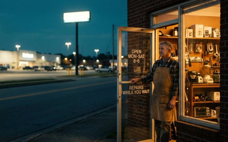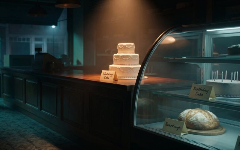
Put two ads side by side. Same product, same price, and roughly the same money spent making them. One feels expensive. You'd believe the price. The other feels like a flyer stuck under your windshield wiper. Most owners look at that gap and assume the premium one had a bigger production budget behind it.
It almost never does. Looking expensive and looking cheap are both the result of choices, and the choices cost the same: nothing. Premium is a handful of deliberate decisions about what to include, who it's for, and what to leave out. Cheap is the opposite set of decisions, usually made by default. Once you can see the choices, you can make the premium ones on any budget.
This matters for a small business more than for a big one. A national brand can paper over weak creative with sheer spend. You can't. Your ad has to earn its place in the feed on feel alone, and feel is exactly the thing you control for free.
Cheap Isn't a Budget. It's a Set of Choices.
Before we fix it, let's name what actually reads as cheap, because it's rarely the thing owners think. It's not a slightly grainy photo or the absence of a film crew. It's these, and you can spot every one of them in your own ads:
Cramming. Five messages, three offers, a logo, a discount badge, and a wall of text all fighting for the same square. Nothing to rest your eye on. A crowded ad doesn't look busy and important; it looks anxious.
Trying to be for everyone. Copy so broad it could belong to any business in your category. When an ad is written for everyone, it feels like it was written for no one, and "no one" is a cheap feeling.
Default imagery. The generic smiling-headset stock photo, or the AI image with that plasticky sheen everyone now recognizes on sight. It signals "we grabbed the first thing," and people read that instantly.
Loud discounting. A giant "40% OFF" slapped across everything. Nothing says "please, anyone" quite like a permanent sale.
Inconsistency. Every post looks like it came from a different company. No through-line, so nothing accumulates into a brand you'd recognize.
None of those are budget problems. They're restraint problems. And each one has a free fix.
The Fastest Way to Look Premium Is to Remove Something
The first lever is restraint, and it's the one that moves the needle most for the least effort. Premium creative subtracts. It picks one idea, gives it room to breathe, and cuts everything else.
There's a story from the making of the first iPhone that says it perfectly. The early prototypes had a cluster of buttons. Steve Jobs kept sending them back, pushing to strip the design down, again and again, until the phone shipped with a single button on the face. The restraint was the premium. Every button they removed made the thing feel more expensive, not less.
Your ad works the same way. One clear message reads as confident. A pile of competing messages reads as desperate, like a business that isn't sure why anyone should buy and is throwing everything at the wall. Whitespace, the empty room around your subject, is not wasted space. It's a signal that you know exactly what the one thing is and you're comfortable letting it stand alone.
The practical version: for your next ad, write down every element you want to include. Then cut it in half. Then look at what's left and see if you can cut one more. What survives is almost always stronger than the crowded version you started with. This is the same rule of one we cover in Creative Strategy Isn't About Being Creative, applied to how the ad feels rather than how it's built.
Premium Brands Don't Shout at Everyone. They Whisper to Someone.
The second lever is specificity. Cheap creative tries to be for everyone. Premium creative is unmistakably for a particular person, and that narrowness is exactly what makes it feel valuable.
This is counterintuitive, so sit with it. You'd think casting the widest net catches the most people. In feel, the opposite happens. An ad that clearly knows who it's talking to, that reflects a specific person's taste and aspirations, reads as a club worth belonging to. An ad aimed at everyone reads as a warehouse. People don't aspire to belong to a warehouse.
There's a distinction here worth holding onto. Premium exclusivity is not fake scarcity. "Only 3 left, buy now!" is a cheap trick, and most people see through it. Real exclusivity is a narrative: this is for people who value X. The product becomes a small statement about who the buyer is. A premium pet food ad that speaks specifically to the owner who reads ingredient labels and treats the dog like family will always feel more premium than one shouting "healthy dog food for less," even though the second one is chasing more people.
For your business, the move is to pick that person and let the ad be openly, comfortably for them. You will feel like you're excluding buyers. You're not. You're giving the right ones a reason to feel seen.
Sell the World, Not the Spec Sheet
The third lever is story, and for a small business it's simpler than it sounds. Cheap creative lists what the product is. Premium creative shows the world the product lives in.
Nobody falls in love with a spec sheet. They fall in love with a life. A local coffee roaster can run an ad that lists origin, roast level, and bag size, and it will read like a catalog. Or it can show the quiet of a Sunday morning, the first cup, the ritual, and let the coffee be the thing at the center of a life the viewer wants. Same product, same cost to shoot. One sells beans. The other sells the morning.
You don't need a narrative arc or a big production. You need to answer one question: what does life look like for someone who has this? Show that. Put the product inside the moment it belongs to instead of on a white background with a list of features next to it. The features can live on the landing page, where a ready buyer will happily read them. The ad's job is to make someone want the world first.
Your Brand Should Be Recognizable With the Logo Covered
The fourth lever is consistency, and it's the one small businesses abandon fastest. Premium brands look like themselves every single time. You could cover the logo and still know who it is from the colors, the framing, the tone of voice. Cheap brands reinvent themselves every post, so nothing ever adds up.
Consistency compounds. The first time someone sees your ad, it's a stranger. The tenth time, if it has looked and sounded the same each time, it's familiar, and familiar is halfway to trusted. If every ad looks like a different company, you reset that counter to zero every time and never build the recognition that makes a brand feel established.
This does not require a five-figure brand guide from an agency. Pick two or three constants and hold them without fail: one or two colors that are yours, a consistent tone of voice, a recurring visual framing or type treatment. That's enough. The discipline is in never breaking them for the sake of a clever one-off. Boring consistency beats exciting variety here, because the goal isn't to impress once, it's to be remembered.
The Discount That Quietly Makes You Look Cheap
One more thing sits underneath all of this, and it's the habit that undoes premium faster than any design choice: the reflexive discount.
When money is slow, the tempting move is to blast a sale. And a discount can work as a one-time event with a real reason behind it. But when "20% off" becomes your regular message, two things happen. You train your customers to never pay full price, because another sale is always around the corner. And you quietly tell the market that your real price was never justified, which is the exact opposite of premium. A brand that's always on sale isn't a bargain in people's minds. It's a brand whose price they no longer believe.
Premium brands are careful here. When they do offer something, they frame it as access or a reason, not a fire sale: an early look for the people already in the club, a bundle that makes sense, a genuine occasion. The offer supports the story instead of stepping on it. If your discounting is louder than your actual message, it's worth pulling back, even when the short-term math tempts you.
What to Change Before Your Next Ad
None of this needs a bigger budget, a new camera, or an agency. It needs a few different decisions, and you can make them this afternoon:
Say one thing. Cut your next ad's elements in half, then look for one more to remove.
Pick one person. Write it for a specific someone and let it be openly for them, not for everyone.
Show the world, not the spec. Put the product inside the life it belongs to; save the feature list for the landing page.
Hold your constants. Choose two or three visual and voice constants and refuse to break them, ad after ad.
Ease off the discount. Lead with the value, not the markdown, and reserve real offers for real reasons.
Do those consistently and your creative will start to feel expensive on the same budget you're spending now, because the feeling was never coming from the budget in the first place.
Premium Is a Decision, Not a Line Item
The businesses whose ads look premium aren't the ones spending the most on production. They're the ones making the disciplined choices: saying one thing, choosing one person, showing a world, staying consistent, and holding the line on price. Every one of those is available to a business of any size, today, for free.
We help small businesses build creative that performs and feels the part, so if you'd rather hand that off and get back to running the business, we're glad to help. And if you'd rather learn to make these calls yourself, that's genuinely the better outcome, and we're happy to point the way. Either way, we're here.